Fitting the "339 bytes of responsive CSS" in a tweet, with a twist published on 17 May 2019, 1 minute read
Being amazed by how good and functional a web page can be by just using 339 bytes of css, I decided to play a bit with it and adapt it to my needs.
The styling of the post you are reading right now, (minified, except syntax highlighting css) fits in a tweet. It has the following features:
- responsive - looks good on any screen
- is friendly to source code
- does not use external fonts to save bytes and the planet
- it supports Safari’s dark mode
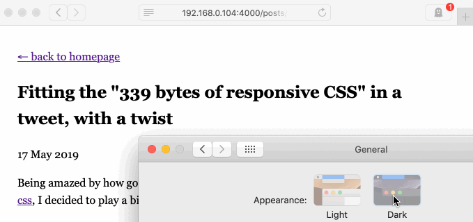
Here’s how the dark mode switching looks in action:
And here’s the unminidied, annotated source:
body {
  font-family: Georgia, serif;
  line-height: 1.6;
  /* when you use relative units, stuff looks good on any screen */
  max-width: 40rem;
  padding: 2rem;
  margin: auto;
}

img {
  /* make sure that all images fit in the viewport */
  max-width: 100%;
}

pre {
  /* add a line to separate code blocks visually from usual text */
  border: 1px solid #eee;
  border-width: 1px 0;
  /* Pre blocks don't wrap (and shouldn't). Scroll their content in case
  they overflow so that the viewport size stays the same */
  overflow-y: scroll;
}

@media (prefers-color-scheme:dark) {
  body {
    /* the dark mode just inverts everything, using a black background */
    filter: invert(1);
    background-color: black;
  }
  img {
    /* the invert filter above inverts images as well, so we'll need
    to revert that effect */
    filter: invert(1);
  }
}
Read more posts
- On logic in a Rails app, revisited 6 years later 18 May 2019
- Enforcing that a ruby method is called from a specific location 28 Jun 2017
- Log filename, line and function name in ruby automatically 11 May 2013
- Unity performance tweaks 20 Mar 2013
← back to homepage